Measures of Central Tendency
Mean = the sum of the scores / the number of scores
- = skewed by the extremes
Median = the middle of an ordered list
- = does not take into account the extremes
Mode = the most occuring number
Bimodal = Two modes
Measures of Dispersion
Range = highest score - lowest score
Standard Deviation =
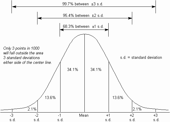
Small S.D. = scores close to the mean
Large S.D. = far from the mean
Correlation =
- a statistical relationship between two or more variables (anything that can change such as IQ, temperature etc)
- Two variables = co-variates
Positive


Advantages
- useful when an experiment is impractical or unethical
- helps prove if it's worth investigating further
Disadvantages
- cannot tell cause and effect only hints at a relationship... lacks power and rigour of experiment
Presenting Data
Scattergrams

- display results of correlation.
- quick visual impression
- each point on the graph is the point where the scores of the two variables names on the axes cross.
- looking at the general spread of the points tell us the extent the two variables relate.
Tables
Bar Chart

- discrete data
Histograms

Don't get confused with Histograms and Bar Charts!
Histograms have history so they stick together. Bar charts are barred from seeing each other.
Frequency Polygons

Percentages
- Tables, bar charts, histograms, pie charts
- If you scored 43 out of 89 in a test you divide 43 by 89, which equals 0.48. You then multiply 0.48 by 100 = 48%.
Pie Charts
- Visual impression of different proportions which various groups of participants share
- segmants represent a percentage

No comments:
Post a Comment